Segmentation
Separate conditions and needs into dedicated user journeys.
A multi-page care home website featuring medical services, rehabilitation programmes, a video presentation and consultation access throughout the user journey.
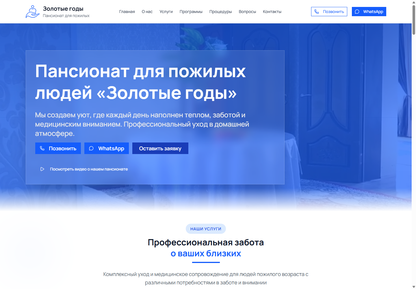
Visitors compare dementia care, post-stroke rehabilitation, care for bedridden people and disability support. Content must provide specifics, maintain a warm tone and lead to a consultation. The main overview is therefore supported by dedicated service and program pages.
Separate conditions and needs into dedicated user journeys.
Show the team, care process and day-to-day life at the residence.
Repeat contact options at key decision points.
Keep lengthy medical explanations easy to read.
The architecture was reconstructed from public navigation, internal links and accessible routes.
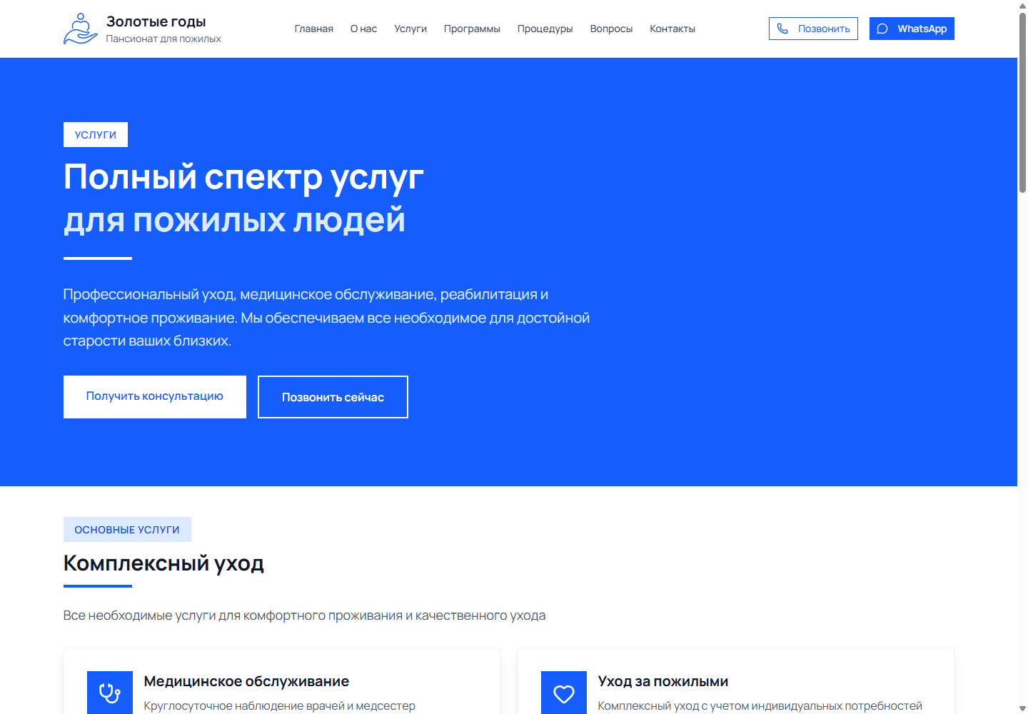
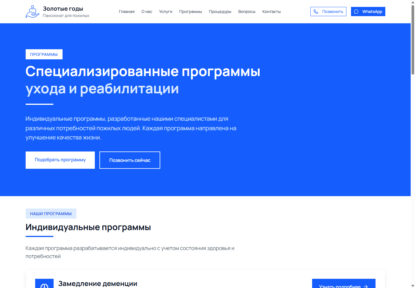
The service overview helps visitors identify the relevant area. Detailed pages explain care and the expected process, while program pages outline duration and activities. A video introduction builds familiarity, and the shared layout provides forms and direct contact channels.
Server Rendering and Shared Layout
dementia, bedridden, disabled, rehabilitation
dementia-care, stroke-recovery, healthy-day, psychological
Consistent Components Across All Routes
Client-Side Validation and Feedback
Visual Introduction to the Care Home
Introduction to the Workspace
Consultation About a Loved One’s Condition
Phone and WhatsApp
Dedicated Service and Program Pages
The homepage has a title, description and Open Graph. During the audit, its canonical URL pointed to another domain, zolotye-gody.kz, and the sitemap listed only five URLs despite 15 available internal routes. JSON-LD was also absent. The improvement plan is clear: correct the canonical URL, include all landing pages in the sitemap, and add NursingHome, Service, FAQPage and BreadcrumbList schema.
Medical percentages and claims published on the original website are not treated as proven case study outcomes. The technical audit records only the observable implementation.
Navigation, headings, cards and calls to action are reorganised into a single vertical flow. The mobile screen below is an authentic capture of the original interface at a width of 390 px.
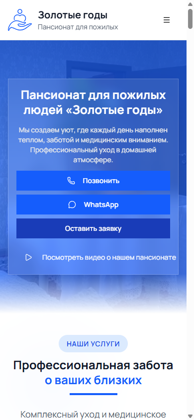
The home page and key internal pages, response statuses and redirects were verified.
Title, H1, description, canonical, Open Graph and JSON-LD were captured.
The technologies were verified through the names of public scripts, styles and API endpoints.
Homepage reviewed at 1440 × 1000 and 390 × 844.
The information model was validated against navigation, archives and the sitemap.
Every interface in this case study is an authentic project screenshot with no generated UI.
15 internal routes and 4 programmes. The solution can evolve as the content and new user journeys grow.
View Project ↗We will analyse the audiences, content, integrations and search demand, then design the structure and technical architecture before visual design begins.
Discuss the Project ↗Back to Case Studies