Trust
Immediately explain the center’s status, mission and national scope.
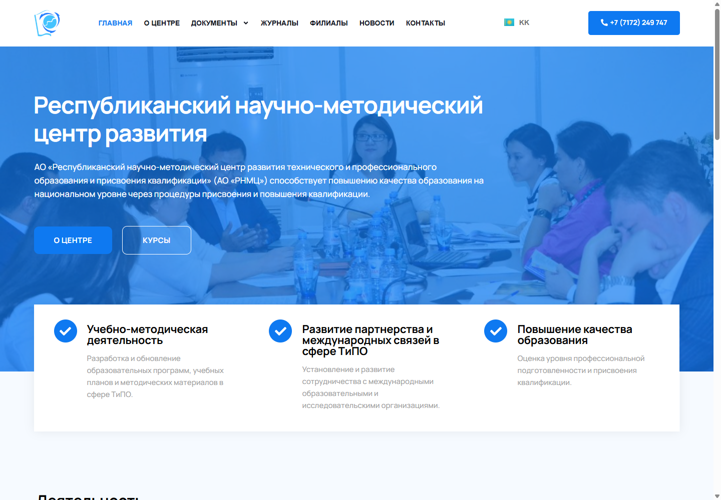
The RNMC corporate and education platform: centre activities, regulatory resources, courses, branches and news in one interface.
RNMC publishes regulatory documents, methodological guidance, educational programs, textbooks, journals, courses and news. Users need quick access to the right resource type and a clear understanding of the center's role. Editors need to update archives independently without assembling pages manually.
Immediately explain the center’s status, mission and national scope.
Separate regulations, strategies, recommendations and learning materials.
Present professional development programs and course terms.
Make the regional structure accessible from the main navigation.
The architecture was reconstructed from public navigation, internal links and accessible routes.
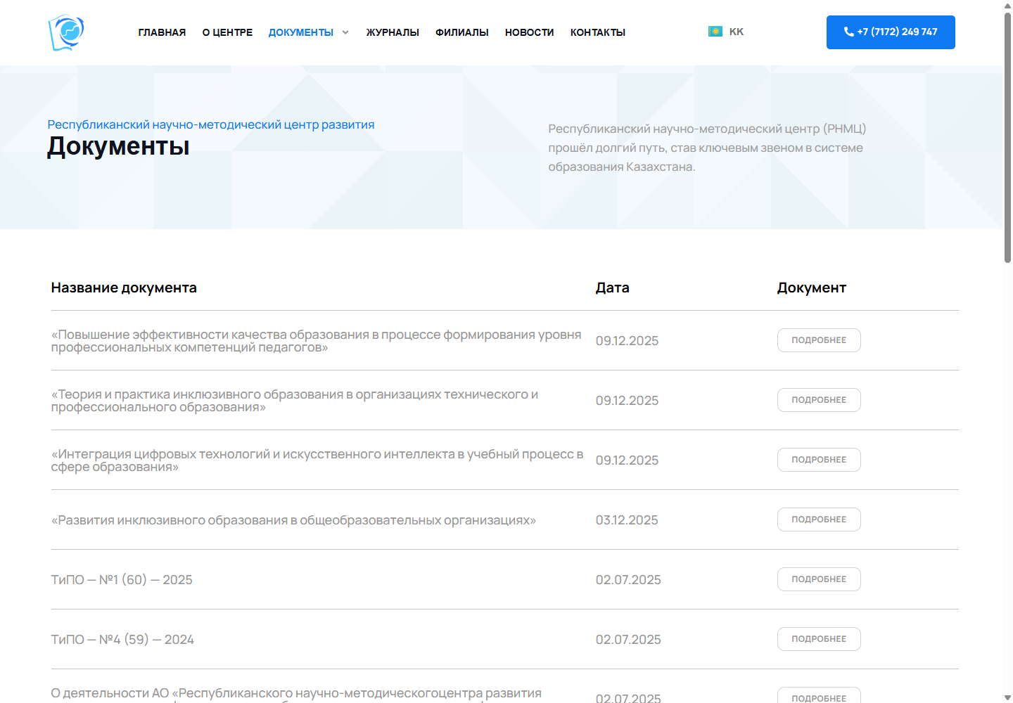
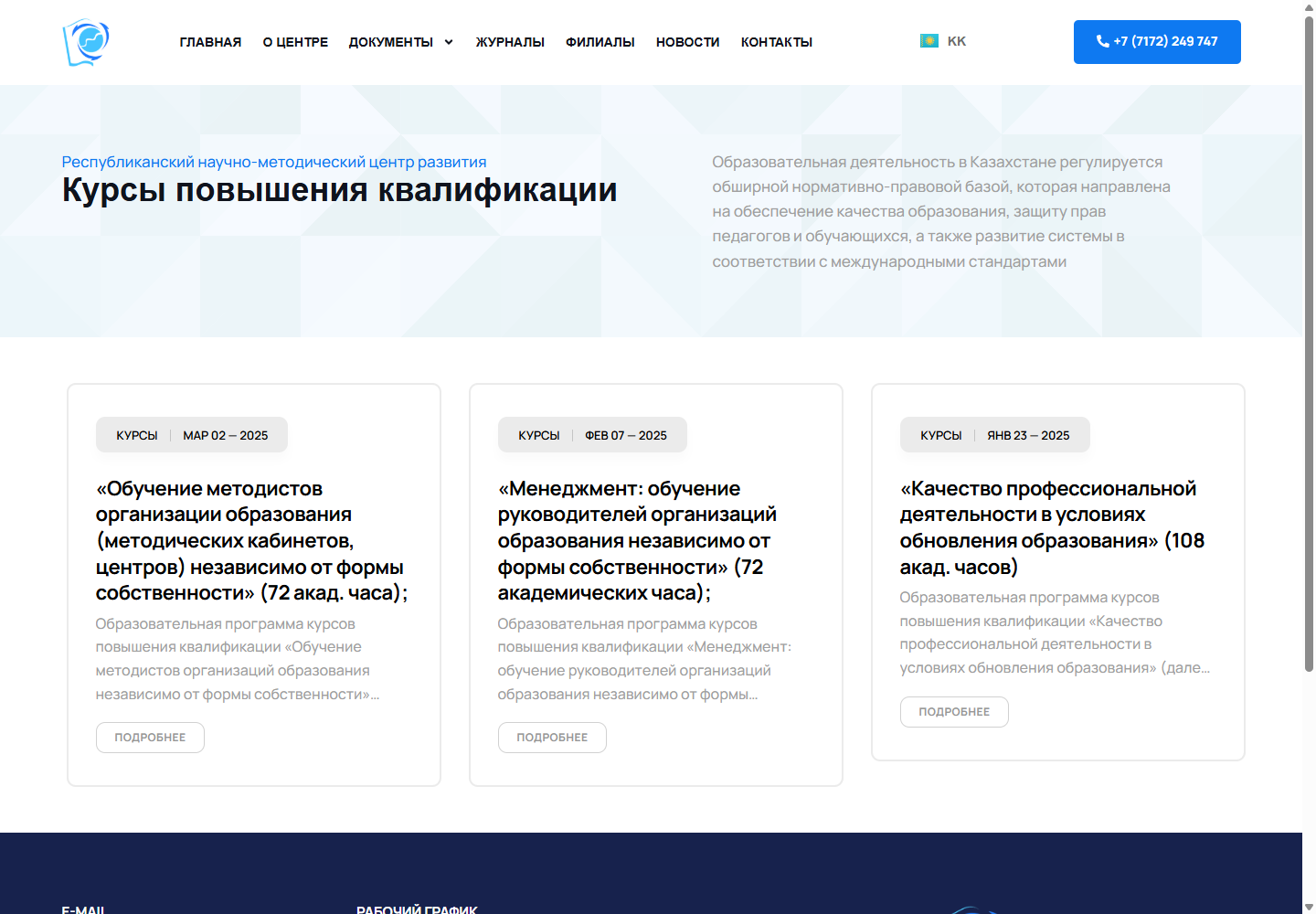
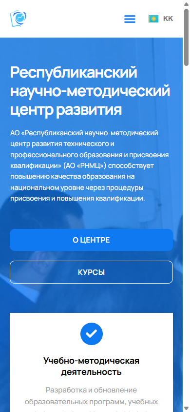
The opening screen explains the center's role and directs visitors to reference information or courses. The document archive is organized by purpose, course cards show dates and meaningful descriptions, and contacts and a form complete the inquiry journey. Both languages share the same structure.
Permanent Corporate Sections
Chronological Editorial Feed
Strategy, Regulations, Recommendations, and References
Program Cards and Schedule
Presentation and training-material files
Linked Versions via Polylang
Access to Nine Areas
Reusable Document and News Cards
Testimonials and Media Content
Request and Feedback
The homepage has a canonical URL but lacks a meta description, Open Graph and JSON-LD. Standard WordPress sitemap endpoints returned 404 during the audit. Priorities for a public educational resource include an indexable document map, unique archive descriptions, Article/Course schema and correct alternate links.
Component versions were identified from public CSS/JS URLs on 09.09.2026. The audit describes the accessible frontend and does not disclose private qualification-awarding processes.
Navigation, headings, cards and calls to action are reorganised into a single vertical flow. The mobile screen below is an authentic capture of the original interface at a width of 390 px.
The home page and key internal pages, response statuses and redirects were verified.
Title, H1, description, canonical, Open Graph and JSON-LD were captured.
The technologies were verified through the names of public scripts, styles and API endpoints.
Homepage reviewed at 1440 × 1000 and 390 × 844.
The information model was validated against navigation, archives and the sitemap.
Every interface in this case study is an authentic project screenshot with no generated UI.
2 languages and 9 document categories. The solution can evolve as the content and new user journeys grow.
View Project ↗We will analyse the audiences, content, integrations and search demand, then design the structure and technical architecture before visual design begins.
Discuss the Project ↗Back to Case Studies