Alert
Communicate calmly and clearly about everyday care.
The «Qarttar Qazynasy» care home website: a reassuring way to choose accommodation, with transparent prices and quick contact for families.
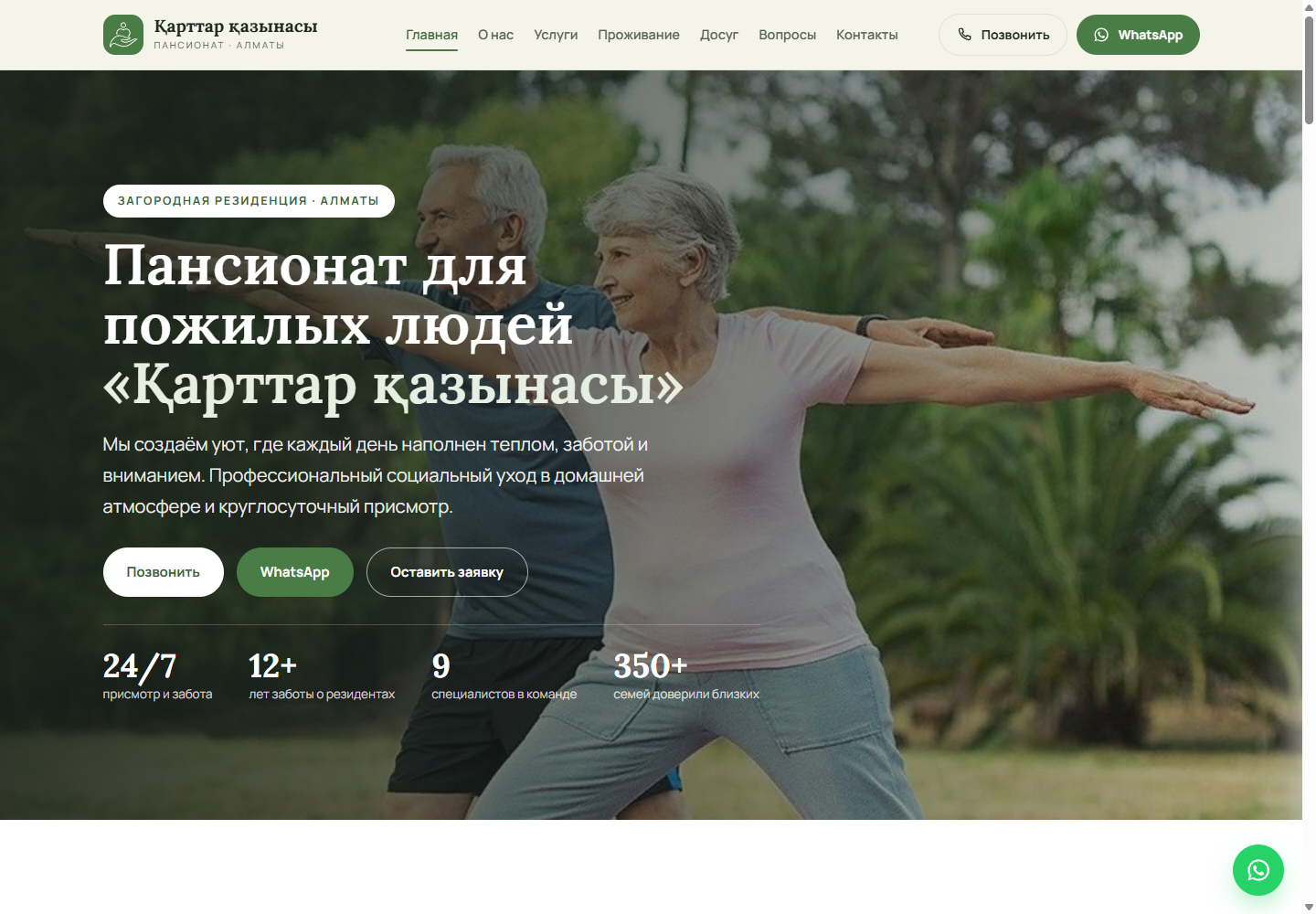
Families need to understand the conditions quickly, feel confident about safety and receive a personal response. The website therefore moves from trust and services to specific accommodation options, pricing, questions and tour booking. Phone and WhatsApp remain available at every key step.
Communicate calmly and clearly about everyday care.
Separate long-term, respite and day-care options.
Present plan features and terms without an overloaded form.
Keep click-to-call and WhatsApp accessible on every device.
The architecture was reconstructed from public navigation, internal links and accessible routes.
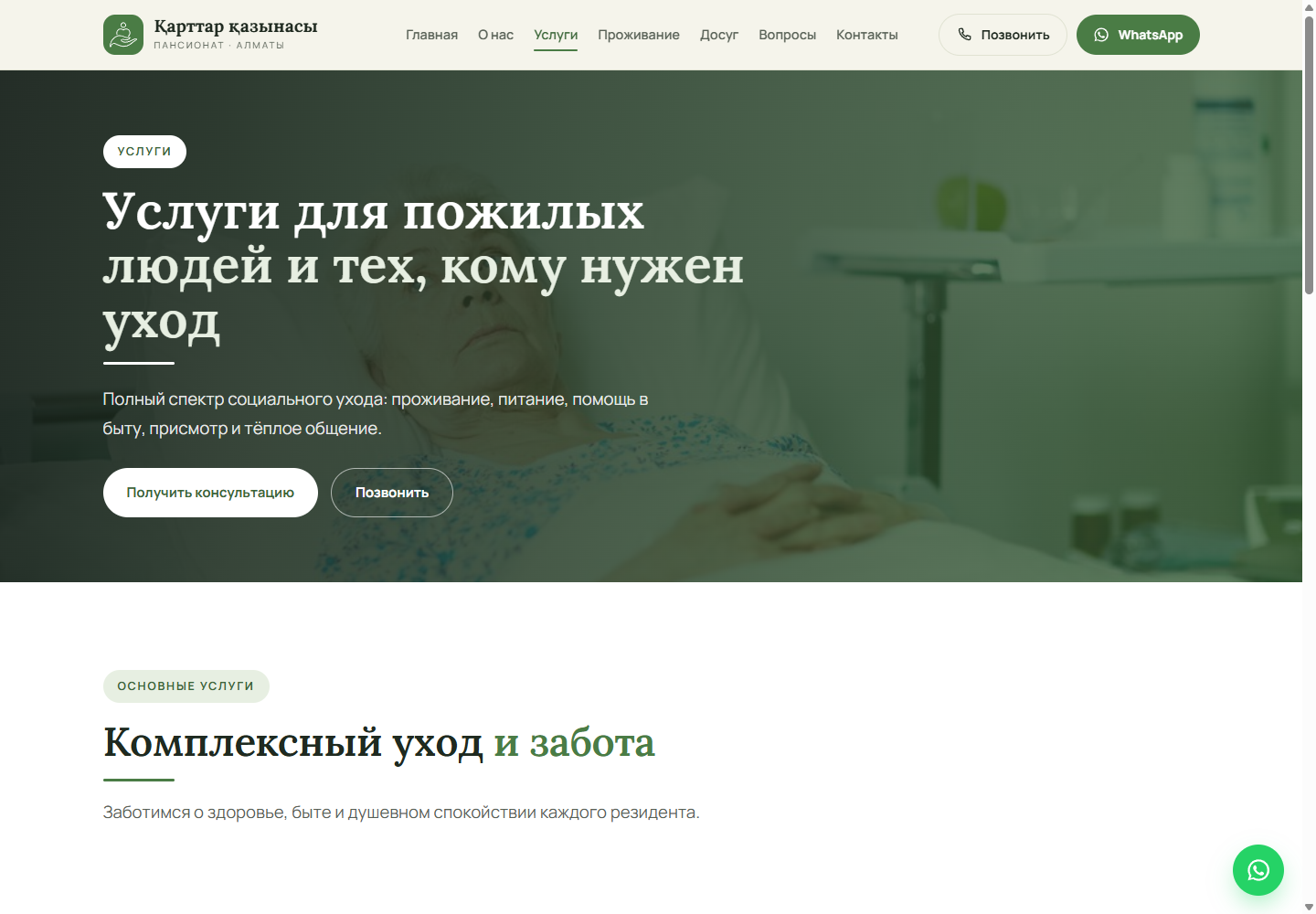
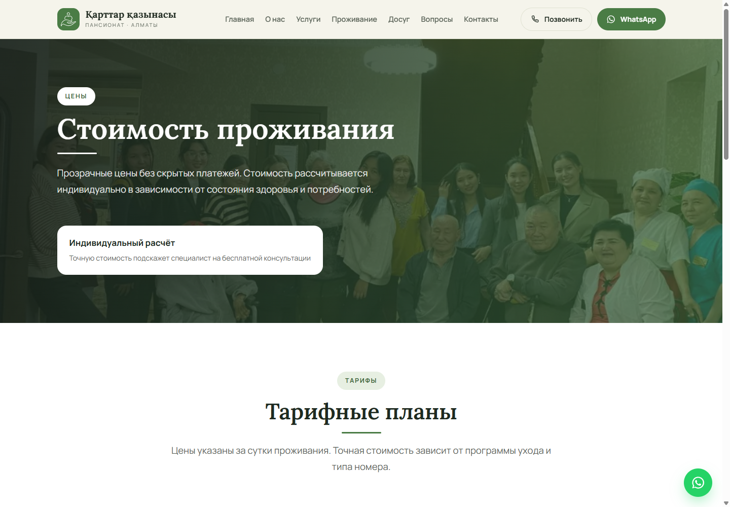
The homepage builds initial trust through clear benefits and an explanation of the admission process. The services page explains the care provided, pricing compares options, the FAQ addresses common concerns, and contacts turn research into a call, WhatsApp conversation or tour.
Clear Search-Optimized Landing Pages
Typography, Grids, Buttons, and Cards
Minimal Client-Side Code
Name, Phone, Objective, and Message
Easy, Direct Contact
Local Selection Signals
Persistent WhatsApp Access on Long Pages
Name and Phone Validation
Expand Questions Without Navigating Away
Compact Mobile Navigation
The homepage includes a description, canonical URL, Open Graph and specialized NursingHome JSON-LD with the address, phone number and price range. The sitemap lists eight pages. This provides a strong local search foundation; further improvements include BreadcrumbList on internal pages, FAQPage for questions and dedicated LocalBusiness signals for maps.
The team and experience figures in this case study reproduce public information from the website itself. They are not presented as independently verified Evolute results.
Navigation, headings, cards and calls to action are reorganised into a single vertical flow. The mobile screen below is an authentic capture of the original interface at a width of 390 px.
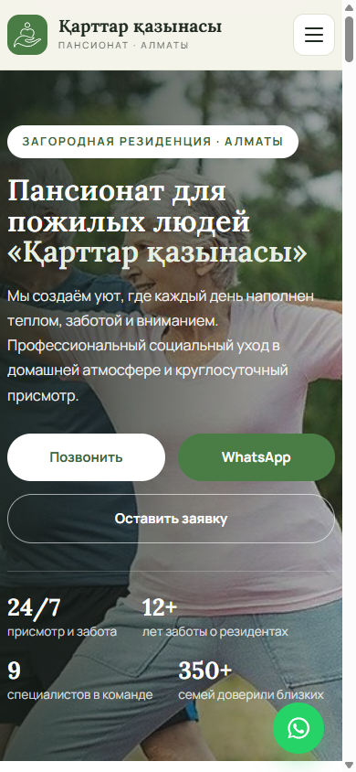
The home page and key internal pages, response statuses and redirects were verified.
Title, H1, description, canonical, Open Graph and JSON-LD were captured.
The technologies were verified through the names of public scripts, styles and API endpoints.
Homepage reviewed at 1440 × 1000 and 390 × 844.
The information model was validated against navigation, archives and the sitemap.
Every interface in this case study is an authentic project screenshot with no generated UI.
8 SEO pages and 3 enquiry channels. The solution can evolve as the content and new user journeys grow.
View Project ↗We will analyse the audiences, content, integrations and search demand, then design the structure and technical architecture before visual design begins.
Discuss the Project ↗Back to Case Studies